Quinta da Arrábida

Overview
João Pato, with whom I had the pleasure of working on another project a few years ago, had the project of converting a stunning family property — with around 4 hectares and located in the heart of the Serra da Arrábida — into an estate aimed at the upper-middle segment of the leisure tourism market.
He approached me to help him develop a user-friendly and elegant website that would serve as a “window” for visitors to get a small glimpse of Quinta da Arrábida, its setting and very special atmosphere, and to book a visit to the quinta.
Discovery and definition
In the discovery and definition phase, I carried out the following activities in collaboration with the client:
Audience definition
We identified and characterised QdA’s main type of customers and draft some proto-personas that include their sociographic characterisation, motivations, needs and pain points when looking for a place to spend their holidays
Competitive analysis
The process of website competitive analysis involves assessing the strengths and weaknesses of your website relative to your competitors. This evaluation is instrumental in pinpointing opportunities for enhancing your website’s performance and achieving a competitive advantage. We identified and evaluated about six competitors in the following dimensions:
- Content quality
- User experience
- CMS type
- Mobile optimization
- Brand and visual style
- Social Media
This helped us, among other things, to realise the importance of certain types of content and had influence on our content strategy later on in the project.
Delivery
Information Architecture & Content Strategy
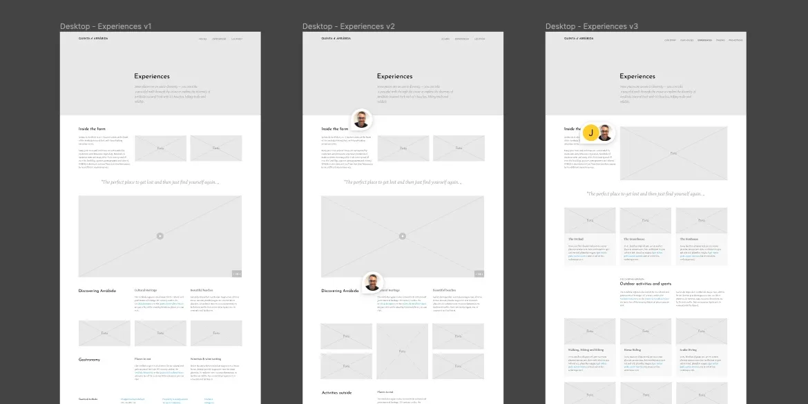
After identifying, discussing and defining with the client the fundamental types of content for the website, I began to do some content mapping — defining which content will go where and how it will support user pathways through the site — and wireframing the main pages.
The global navigation is relatively simple and the final version had only minor changes to the labels as a result of some fairly informal guerrilla usability tests.

Finding a visual style
Due to time and budget constraints, we agreed to define a simple logo and work on rebranding the farm later. So I tried to find a typeface that suited the farm’s vibe and what it represents, and I found an excellent choice in the humanist, elegant and vintage character of Josefin Sans, by typographer Santiago Orozco. I paired it with the Gentium typeface more suited for the website’s longform texts.
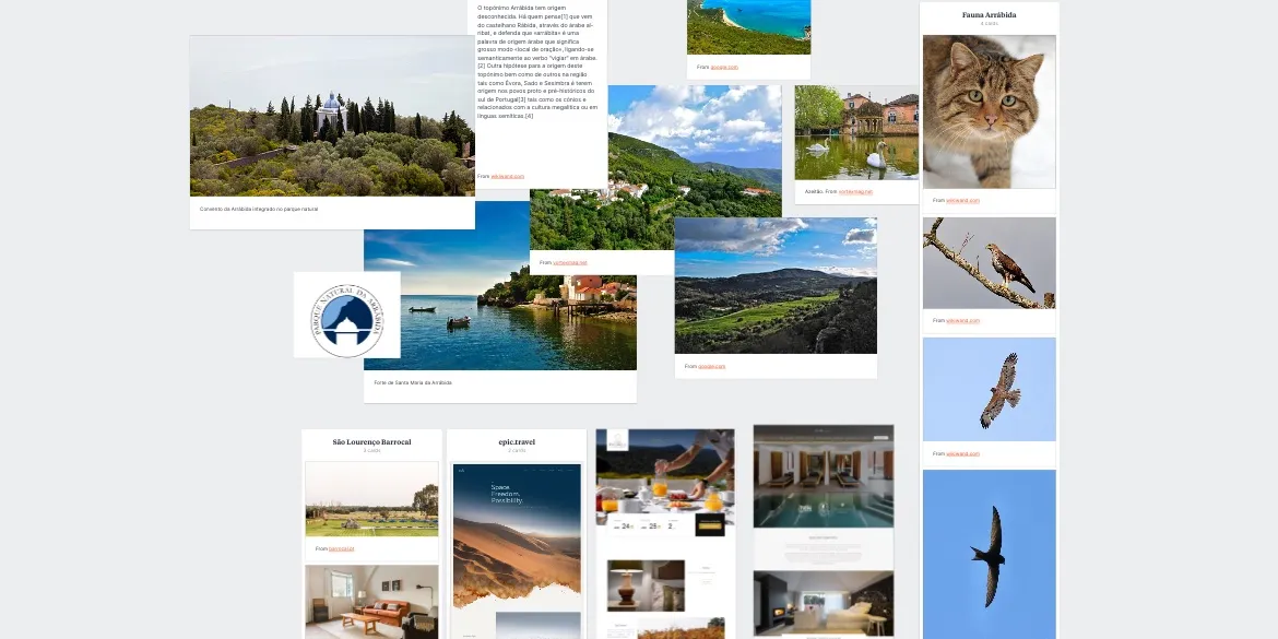
To immerse myself in the exploration of a visual style, I visited the farm and curated a mood board featuring various photos showcasing the diverse flora and fauna of Arrábida’s Natural Park. Additionally, I incorporated images from other websites identified during the competitive analysis.

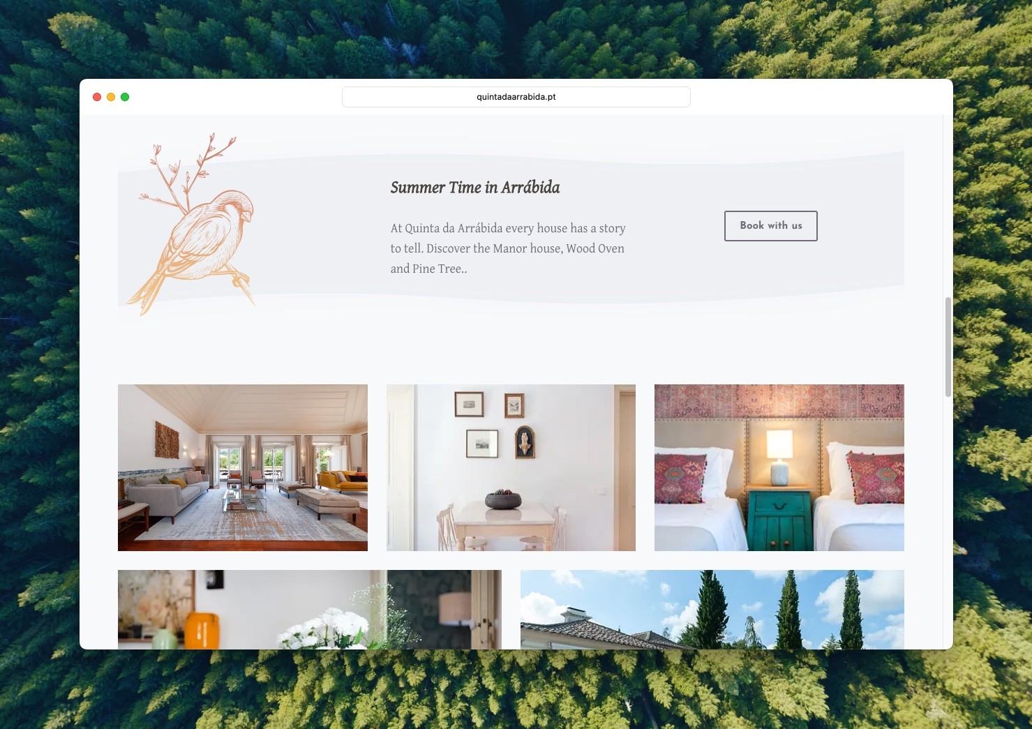
Grounded in nature as a fundamental influence, the final design adopts a color scheme where the predominant tone leans towards a clayish hue, albeit with a heightened saturation. The accent color complements this by taking on a darker shade derived from the primary one. The expanded palette gracefully incorporates the timeless tones of white and a gentle light grey.
Photography takes center stage, playing a pivotal role, as you might expect. Additionally, I also used some nature gravure-style illustrations such as the one featuring the popular arbutus fruit, very popular in Arrábida, to enhance and complement the overall design.
Visually, the end result is a very clean, minimalist site with plenty of negative space that lets the content shine through.
WordPress
The choice of WordPress as the content manager was relatively quick, given the simplicity of the project and the client’s requirements:
- Allowing content to be easily added and updated;
- To work properly on desktops and mobile devices such as mobile phones and tablets;
- Having a relatively large community of suppliers and integrators;
- To be affordable;
WordPress, whether you like it or not, easily fulfils these requirements and has a proven track record.
Outcome
From the moment Quinta da Arrábida’s website was launched, it has experienced continuous growth in both the volume of bookings it receives and the level of support it offers to various sales channels. João expresses complete confidence in the website’s significant role in fostering the project’s expansion and the notable increase in reservations.
Recently, we delved deeper into refining the brand and there are additional ideas and plans in the pipeline for future projects.