Acredita
Overview
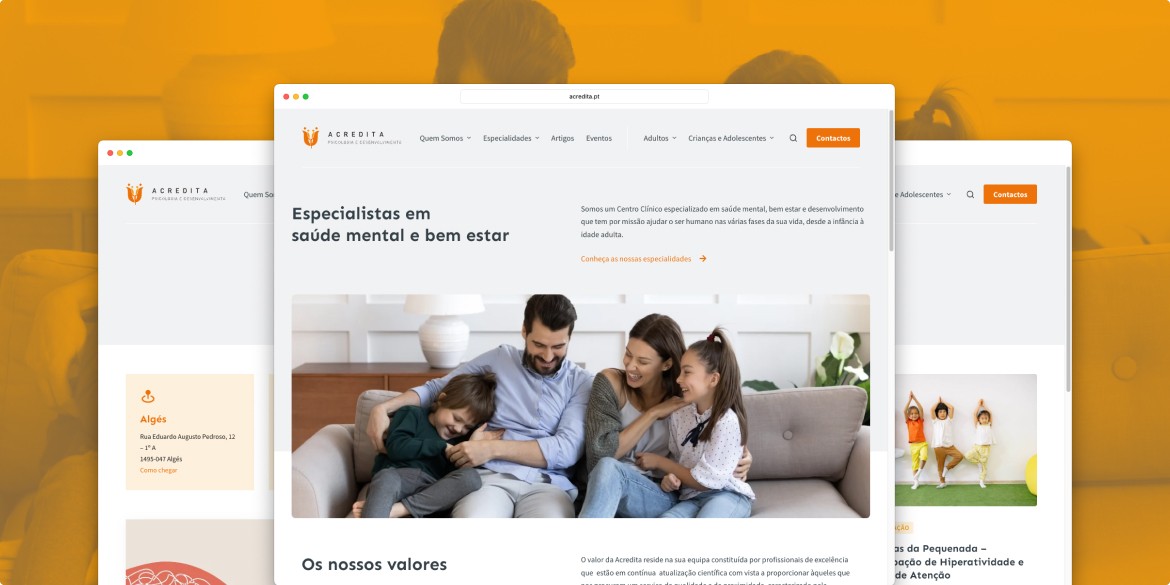
Acredita is a Portuguese clinical centre that specialises in mental health, well-being and personal development. It operates in the greater Lisbon area and online, providing its patients with experienced and qualified professionals in a range of specialities: clinical psychology, child psychiatry, psychiatry amongst others.
The management of Acredita asked me to redesign their website with the following objectives:
- Significantly improve the visual design, making it visually more professional and credible by improving usability and user experience;
- Improve publicity and increase conversions (requests for counselling via the website);
- Align the site with the type of audience it is strategically intended to reach;
- Make the site easier and quicker to update by simplifying the back office.
Discovery and definition
Audience definition
As a UX and web designer collaborating with Acredita, my focus on audience definition has been a pivotal aspect of crafting a digital experience that addresses the nuanced needs of the individuals they serve.
Acredita’s professionals cater to a spectrum of age groups and a wide audience, aiming to be perceived not just as a mental health center but as a support system actively engaged in helping families navigate through the demands of modern life.
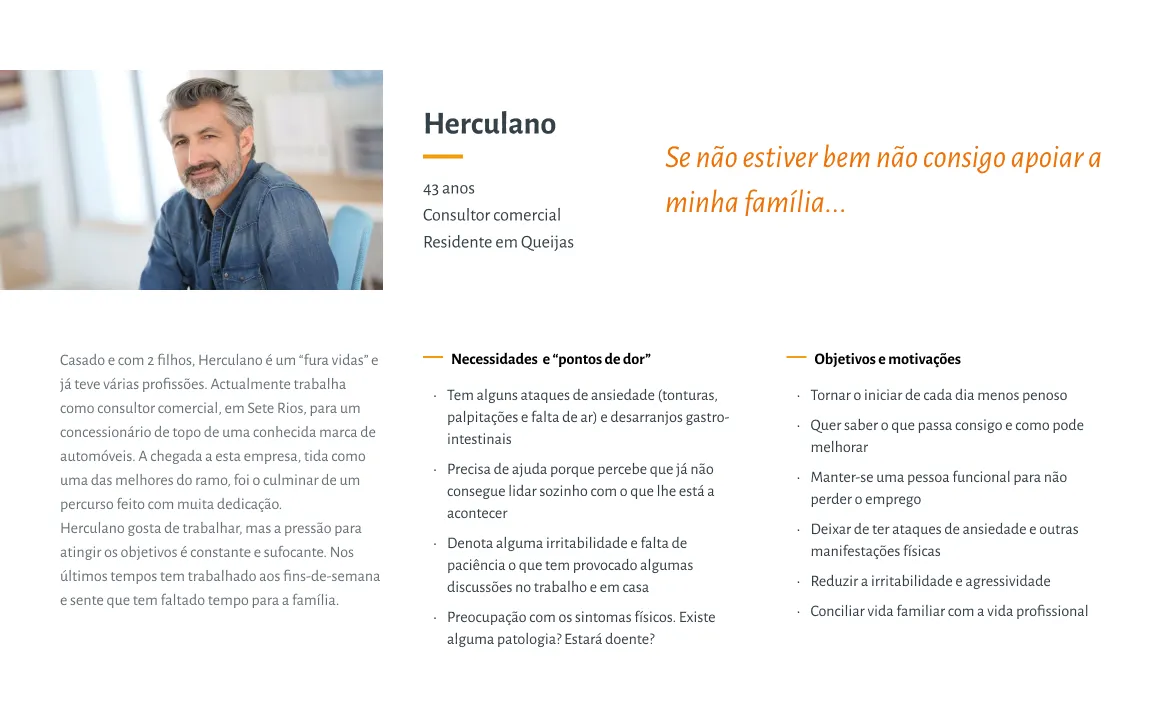
To align the website with these distinctive user needs, I have developed personas that capture the essence of Acredita’s primary audience. For example, one of these personas represents an adult man experiencing work-related burnout and other a mother seeking help for her child with learning problems.
The overarching theme of family support is seamlessly integrated into the design language. Visual elements, messaging, and user pathways are carefully curated to convey inclusivity and understanding, reinforcing Acredita’s identity as a center committed to collaborative support for families facing a myriad of life challenges.
Competitive analysis
In order to optimize Acredita’s digital presence in the mental health and self-improvement sector, a comprehensive competitive analysis was conducted. This research included five Portuguese and two foreign competitors, with the aim of identifying their strengths and weaknesses in key metrics such as: visual design, usability, information architecture, search engine optimization (SEO) and mobile.
The competitive analysis was essential in shaping the redesign of Acredita’s website. Some of the iterative improvements made as a result of this analysis were aimed not only at meeting industry standards, but also at ensuring that we didn’t make some of the mistakes made by our competitors, and that Acredita’s digital presence remains at the forefront of user-centered and effective mental health support.
Delivery
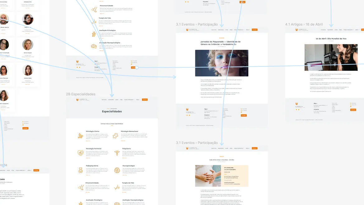
Improving the information architecture
Acredita’s website underwent a significant upgrade to improve the user experience. By refining the information architecture, we aimed to optimise user understanding and engagement across the site.
The changes include separating the global navigation into website sections and audience profiles, refining terminology for clarity, integrating workshops into an events section, centralising contact information in the footer and on a dedicated contact page, and thoroughly reorganising the information architecture at the page level.
These adjustments aim to improve user navigation, simplify terminology, highlight events, facilitate contact and improve the overall structure for a more user-friendly and accessible digital experience.
Aligning with the brand
In redesigning Acredita’s website, I need to align the visual maintaining the brand’s logotype and color scheme. While respecting the defined color scheme I extended it introducing subtle light shades for visual depth.
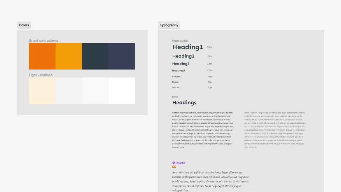
The client wasn’t satisfied with the typographic options chosen for the previous website so we transition to Sen for headings, exuding friendliness, and Source Sans Pro for body text, ensuring readability.
A focus on whitespace added elegance and readability, aligning with Acredita’s commitment to mental well-being. Additionally, a minimalist icon family brought clarity to the specialities section. These design choices collectively form a visually cohesive and brand-aligned digital experience, echoing Acredita’s values with every click.
CMS and frontend implementation
Together with the client, we decided to continue using WordPress as the content management system as it offered a very attractive value proposition in terms of cost, flexibility, community and ease of use.
However, I developed a completely new theme (based on blocks) that uses fewer plugins and several post types to provide a flexible and extensible way of handling different types of content beyond the standard posts and pages. The new website is faster, more accessible and respects industry best practice.
The new website works perfectly on mobile devices and is accessible, faster and respects industry best practices.
Outcomes
The redesign of Acredita’s website has produced effective results that have been praised by both stakeholders and the internal team. The satisfaction of the client, who acknowledged the achievement of all objectives, underlines the success of the project.
Internally, Acredita’s team has embraced the redesign with positivity, confirming its practicality and usability improvements.
Quantitative metrics show a significant 31.5% month-on-month increase in users, accompanied by a commendable 10.6% reduction in the bounce rate. In particular, counselling services have seen a significant 22% increase, reflecting increased visibility and user engagement.
In summary, the results of the redesign demonstrate its strategic value, seamlessly aligning with Acredita’s objectives and enhancing its digital presence.